This magazine cover uses
the basic element of tone. The
intensity of darkness and lightness on Kobe Bryant’s face adds to the dimension
to the photograph. Although the
photograph is monochromatic sense there are a lot of variations of tone, we are
able to clearly make out the photograph.
The black and white photograph adds an aspect of simplicity to the
magazine cover, which can be very cluttered and distracting. The magazine cover also uses
color. The color used for “Vogue”
and for “Kobe Bryant” make them pop out.
They pop out because of the high contrast with the photograph and the
rest of the text.

This magazine layout uses the basic element of scale. The “M” drop cap gives scale to the
rest of the text. The reader is
able to compare the rest of text to the “M” and realize the size
difference. The drop cap adds
dimension to the page rather than having all the text be the same size. It draws in the reader and encourages
them to read it. I think this
layout works well with the use of scale.
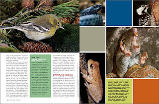
In this magazine layout the basic element used is
shape.
The layout of this
magazine is divided up into basic shapes of squares and rectangles.
The pictures and text fit into shapes
of squares and rectangles.
The
layout seems to use a grid which I think works really well.
The layout looks simple and clean and
is nice to look at.
I like how the
text on the left side makes their own rectangles by how the text is set.
It further gives the prominence of the
use of shape.


No comments:
Post a Comment